who, me?
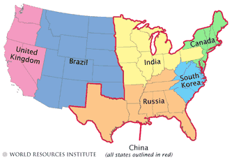
this map, originally from a Science article[pdf], compares relative output of Greenhouse gasses ("GHG") from various countries vis-a-vis the US. The making of the map is discussed here. (via Helmut at Phronesisaical. As he says, maps can often do what words cannot.)
posted by Jonathan Versen at 7:25 PM
![]()


<< Home